ProLiteracy Annual Report
A FRESH SPIN ON BRAND STANDARDS
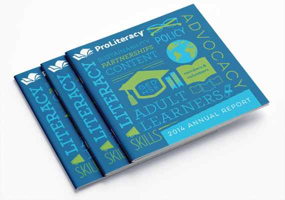
When clients come to me seeking print design, typically they have strong brand guidelines already in place. I love the challenge of finding fresh ways to interpret the existing standards in my work. This ProLiteracy annual report is a great example of how leaning into brand standards can be an asset.
Together with their communications director, the decision was made to break from photo-based covers of the past and use the brand’s concise color palette as the focus. The type lock-up on the cover features icons and shapes that play on the style of their logo, and the look continues thoughout the report.
services
Art Direction, Print Design
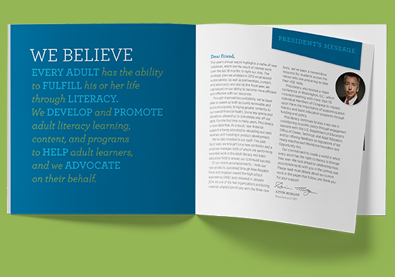
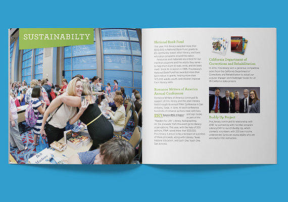
The square format feels friendly in hand. Large photos and unexpected typography keep the message crisp and readable.
“
GiansantiDesign is always our first choice in contracting with freelance designers. Joanna is extremely talented and offers creative and new solutions to our ideas while still maintaining our style and standards.
Amy Schmitz
Former marketing and communications director, ProLiteracy
Based in Syracuse, NY
315.437.7833
hello@giansantidesign.com
©2008–2024 GiansantiDesign, unless otherwise noted